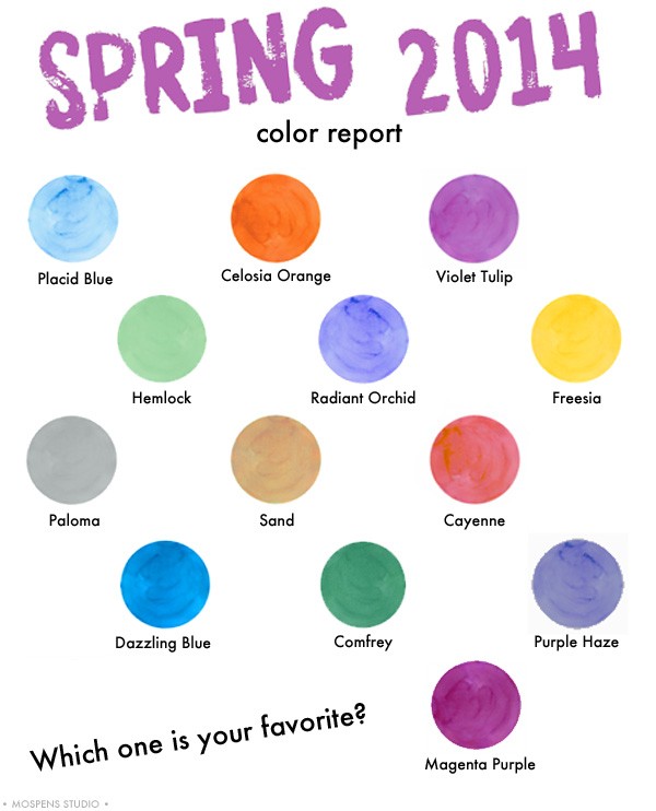
Well, Spring has SPRUNG! At PANTONE that is. They have revealed 2014 Spring Color Report. Fun and fresh bright vivid colors paired with soft pastel hues. Love, love, love!
SPRING 2014 COLOR NAMES AND VALUES
PANTONE COLOR – CMYK VALUE
PANTONE 15-3920 Placid Blue – 47.17.2.0
PANTONE 16-3823 Violet Tulip – 44.39.0.0
PANTONE 15-6114 Hemlock – 39.4.35.0
PANTONE 16-0000 Paloma – 35.24.27.0
PANTONE 15-1225 Sand – 20.27.48.0
PANTONE 14-0852 Freesia – 0.14.100.0
PANTONE 18-1651 Cayenne – 6.74.56.0
PANTONE 17-1360 Celosia Orange – 0.63.80.0
PANTONE 18-3224 Radiant Orchid – 32.65.0.0
PANTONE 18-3949 Dazzling Blue – 92.57.0.0
PANTONE 18-3718 Purple Haze – 56.51.15.0
PANTONE 18-6216 Comfrey – 74.28.63.10
PANTONE 19-2428 Magenta Purple – 51.94.24.24
Since pink is not on the list, I choose the minty fresh hemlock green as my most favorite of the bunch. The violet, orange, blues, and magenta purple come in second place.


Leave a Reply